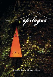
 well, here it is finally. i've had a productive couple of hours, working through the text of the book, fine-tuning and getting a feel for the text itself in order to choose the right cover.
this cover was the crowd favourite when i did my 'market research', and although this isn't the one that came together so miraculously at the beginning of the design process, i think it probably fits the overall feel of this book and my poetry in general.
so here's the background on the cover image: i took the photograph in arthurs pass in the south island (nz) during a trip i did with two singaporean and one american photographer, acting as a guide, in 2004. it was a wet misty day, we pulled over to look at bush scenary. the image is of a moss-covered tree with a orange track marker nailed to it. had to open my aperature right up and shoot at about 1/30 sec i think. shot on 200 asa kodak slide film of some description using my pentax P30.
the motif over the title is a kind of mountain silouette. all the elements are very new zealand - moss, tree, mountain. and for some reason whenever i doodle i always end up drawing a tree on a mountain - which is why i went for those elements.
the title font is 'porcelin' - a double stroke script font which i am also using for the poem titles inside the book. the author name is in zurich bt - my body text font for the book.
publication is looking a lot closer now...
on the headphones: 'end of a century' by blur, from 'the best of blur'. www.blur.co.uk
3 comments:
Cool cover.
> shot on 200 asa kodak slide film
Old skool photographer dude.
I've heard a rumour you were on TV recently - a program about fat people?
-- Anonymous Coward
hey man, if you're going to use terms like 'fat people' you should put your real name. yeah my wife and i were on tv, but it wasn't anything to do with fat, it was to do with the fact that she has had chronic fatigue syndrome. which, if you know anything about it, is a horrible illness that's been robbing her of her life.
Right on anddy. loven the look of the book can't wait to but a copy in a store neer me. keep up the good work :-)
Post a Comment